The Australian Research Alliance for Children and Youth was established in 2002 to help all Australian children and young people to thrive.
We’ve come a long way since then!
Today we want to elevate our holistic approach to children’s wellbeing including all the determinants of health.
So it’s time to represent ourselves in a brand new way…….
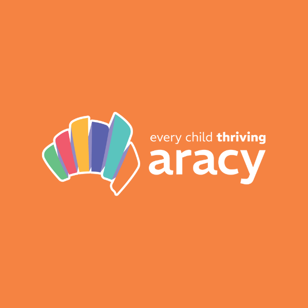
ARACY’s new logo is more than just a picture. It’s a key, unlocking the potential for all Australian children and young people to thrive.
Shaped like Australia, the logo begins by acknowledging where we work. In doing so we pay our respects to the First Nations people of this land. We honour their strong and perpetual connection to Country.
Our logo features a continuous ribbon that unites us beyond the divisions of states, seas, or silos, symbolising the wellbeing of children. Each colour on the ribbon represents an interconnected domain of The Nest, the wellbeing framework developed by ARACY for all Australians. Each colour represents an interconnected domain of The Nest, the wellbeing framework developed by ARACY for all Australians. It’s at the heart of everything we do. Every twist and turn of the ribbon symbolises the tailored support our systems must provide, so all children get a fair chance to thrive.
By putting our mission “every child thriving” right on top of our logo we’re elevating it above a strapline. ARACY’s purpose is clear: for all young Australians to succeed. This logo is a symbol of hope, a promise of a brighter future where every young Australian can reach their full potential.
SHARE THIS

With six connected areas, The Nest ensures young Australians have everything they need for the best start in life, helping them reach their highest potential.

Using The Nest, has helped ARACY to be at the forefront of disease prevention and the promotion of holistic health for young Australians.

Here you’ll see some examples of how The Nest has been used in organisations outside of ARACY across Australia.